
From Data to OQ Program Decisions: Why Dashboards Matter for OQ Managers
Most organizations today sit on vast amounts of information, yet teams still struggle to turn that data into answers they can trust and act on quickly. Static reports, manual exports, and one-off analyses have slowed decision-making and created uncertainty at the moments when clarity matters most to keep programs updated and workers in the field.
That’s why dashboards have become more than reporting tools. When designed well, dashboards are decision enablers — helping teams see what’s happening, understand what matters, and act with confidence.
The Shift from Reporting to Readiness
Modern dashboards do more than show the historical status of workers. They help teams answer practical, forward-looking questions. This shift requires more than charts. It requires trusted data, clear context, and views tailored to how people actually do their jobs — whether they’re supervisors, operations managers, or executives. ITS is well aware of the need to manage a significant amount of data and then review it in customized, easily accessed formats.
Data as a Service: Powering Better Dashboards for the Pipeline Industry
- Curated data access for deep analysis
- Prebuilt Business Intelligence (BI) templates for immediate insight exploration and a springboard for deeper analytics
- Embedded dashboards that make analytics accessible across all roles for day-to-day operational decision-making
ITS Live as an Effective Dashboard for OQ Managers
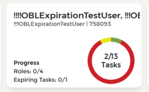
Today, ITS Live is an example of how a dashboard can support real work — not just reporting. By presenting real-time, operationally relevant information in a clear, actionable way, Live helps teams understand readiness. The recent release of Live enhancements includes:- Visual indicators of expiring roles and tasks (including a yellow indicator of approaching expirations)
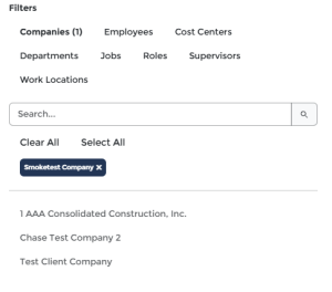
- A consolidated view of both contractor and employee data that saves you time
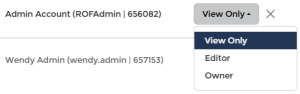
- The ability for multiple owners can view and collaborate on items
- Architecture enhancements have improved performance and enabled future evolution.
What’s Next at ITS
ITS will be delivering dashboards that provide greater automation, self-service, and AI-driven insight in Q2 of 2026 — helping teams anticipate issues, not just react to them. As data becomes easier to access and interpret, dashboards will continue to play a central role in turning information into action throughout the ITS platform and related apps.
Dashboards should not be viewed as optional add-ons — but as strategic enablers. Organizations that leverage these empower their teams to move faster, reduce risk, and operate their OQ programs with greater confidence.
Stay on the Cutting Edge of Operator Qualification
Save your spot in the next Regulation Navigation Webinar on March 11th, 10 am Central.


